Hello everyone,
Finally managed to get a modded world stable enough to have a few large machines running and enjoy their use, including an autonomous concrete factory. With that I’ve built some walls and then realized I don’t have any real experience with modern architecture… so I’ve got a giant white brick surrounding my machines.
Honestly, I’m not used to building on this scale either so I’m not sure how to make this look nice on multiple fronts. One thing I do know though; I don’t like glass curtain-walls so I’d rather not do that for this building in spite of it certainly being big enough.
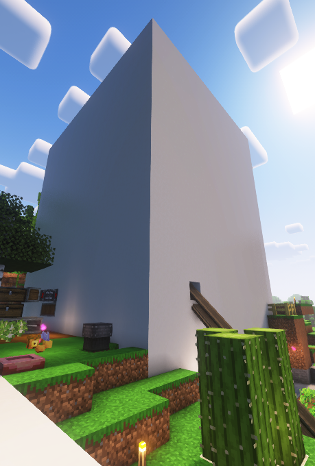
Any ideas?
Yes. Brutalism is unironically my favorite architectural style. Not entirely sure how to translate it to Minecraft but I suppose now’s the time to do it.
Whenever I am building larger structures, I find it helpful to design smaller modular pieces that can fit together to make a larger structure. Maybe you can start with the corners to find a good way to outline the building, and then come up with some variations of tiling wall segments that you can repeat 3 or 4 times across the width of the building. Here are some examples of larger builds from my vanilla world that are just a few modular pieces put together into a larger structure:
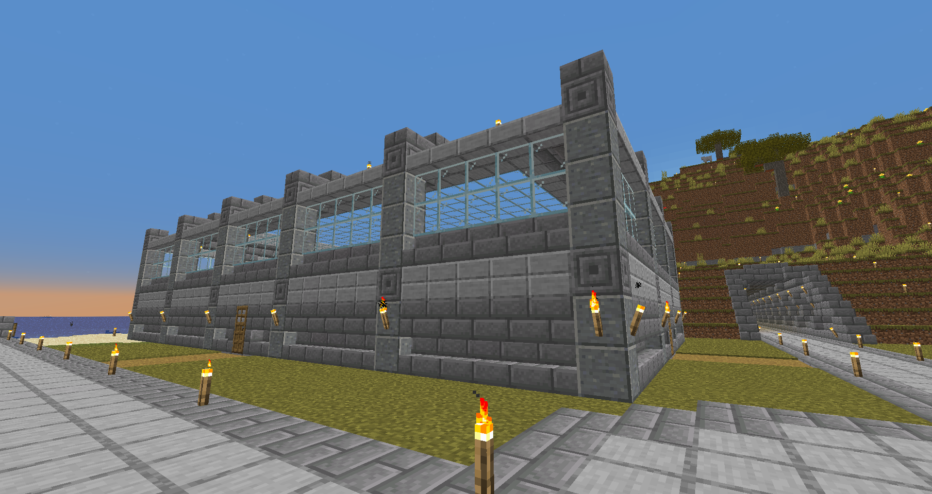
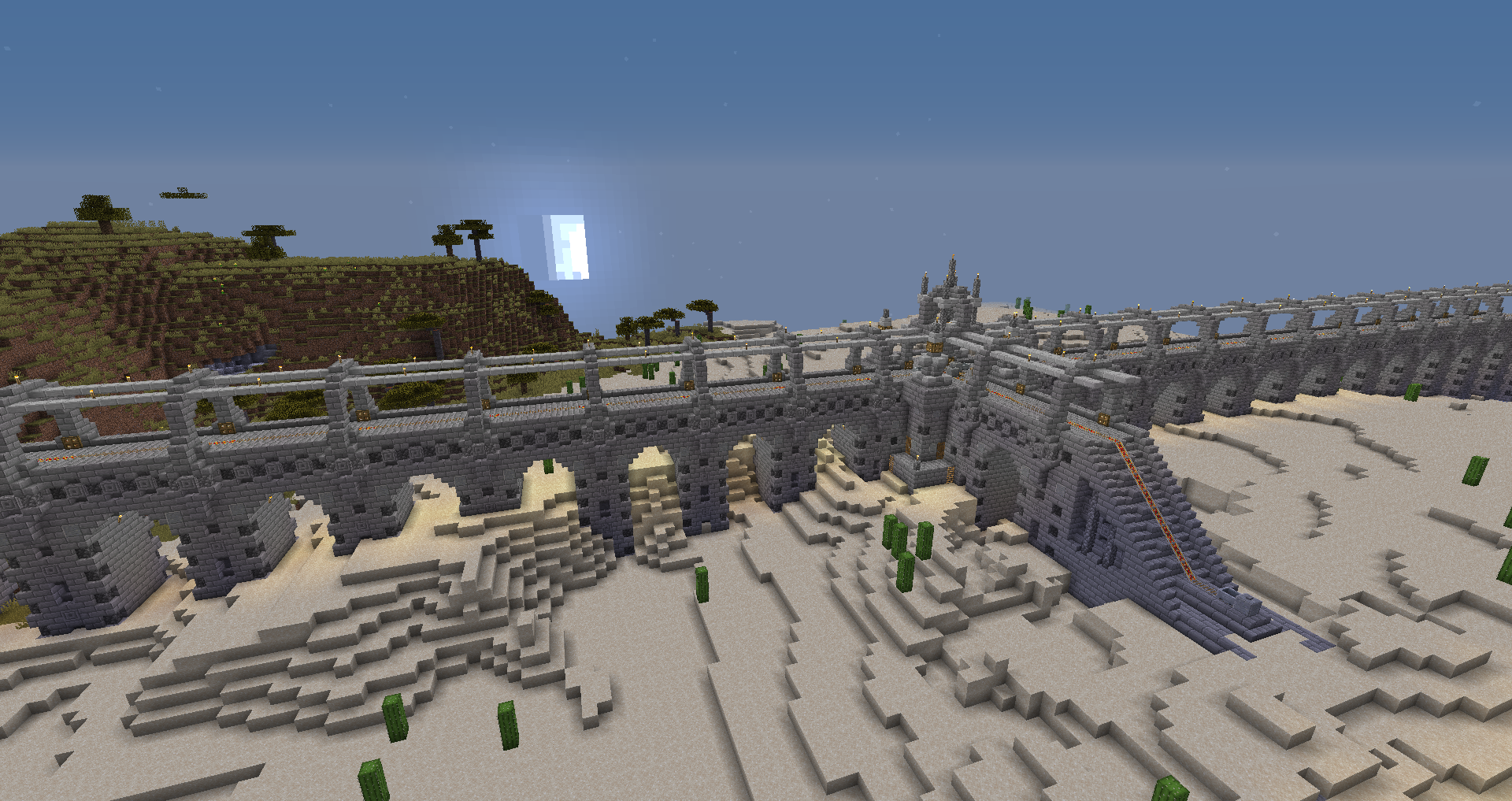
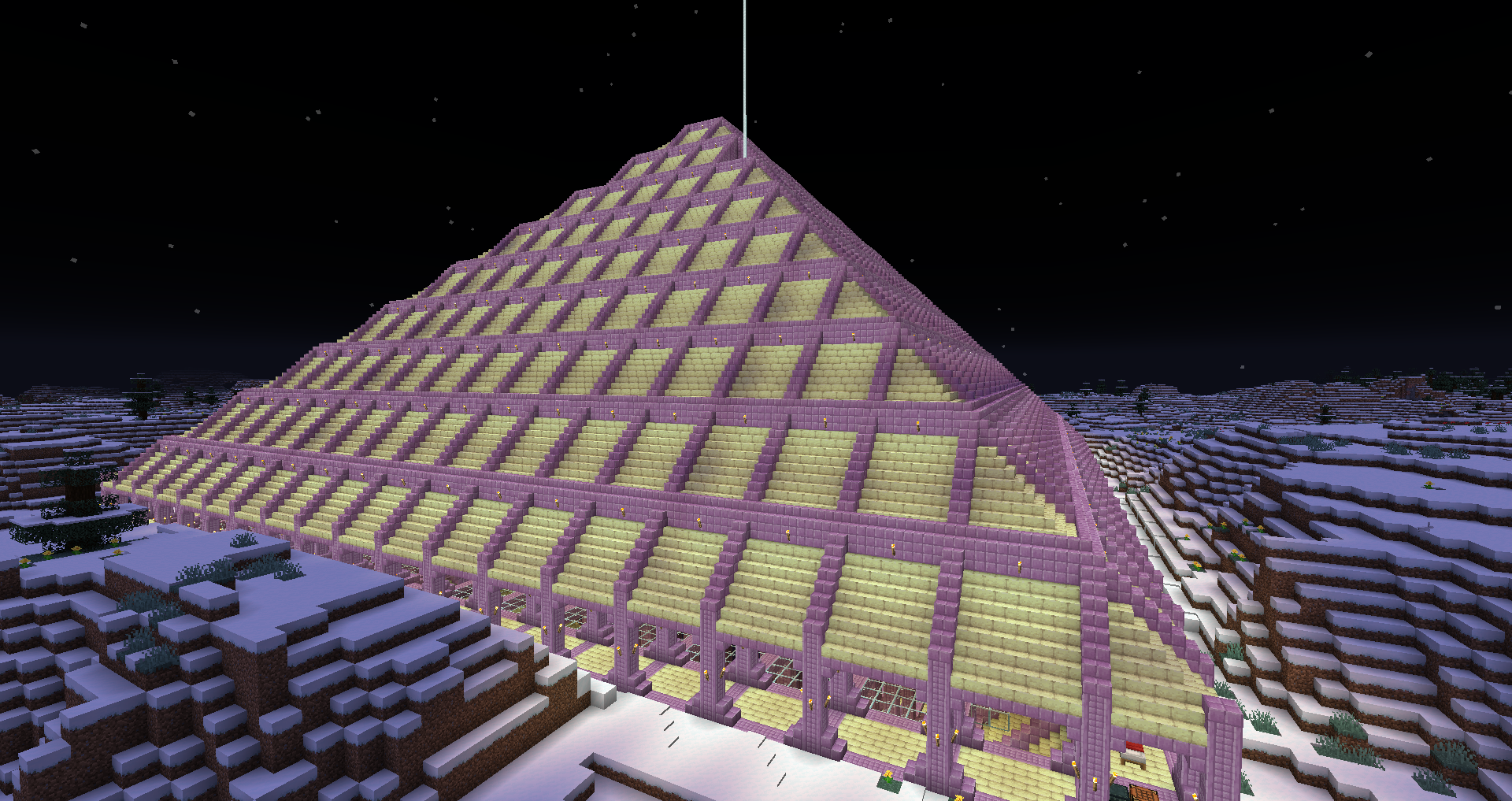
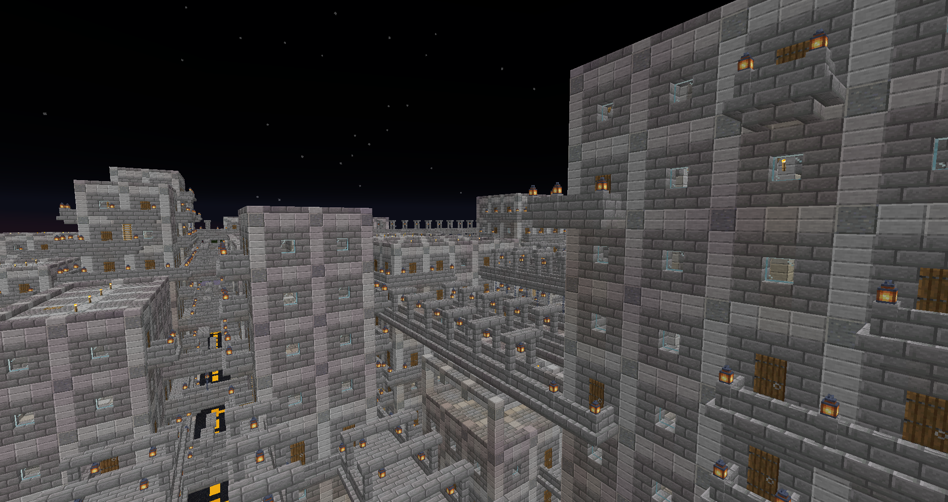
Okay, that pyramid is amazing, and so’s the city.
I’ll see what I can do. For the most part I do need the block I have to stay but I’m thinking on some places I might be able to shave it and I have plenty of space around it to edit outward.
Thanks for the tips!
Grian’s early videos on his channel were all about how to make better looking buildings. The fundamental strategy is to start with a more interesting asymmetric shape as the base and vary the height in various places as well to produce a more interesting shape. For example the entrance could be a short corridor with well defined doorways and its only as high as the corridor needs to be breaking up the cube both on the bottom layer and vertically.
The second part of his steps I recall were depth. So take the corners and put structure and framing on the outside, do this across the entire build to give it that sense of being held up with columns.
The next is all about colour and details where small extra little pieces are added such as frames around the windows and stair cases used to fill corners of framing to make them gradient in.
I highly recommend those early Grian tutorial videos on youtube because they teach some fundamentals that can make any build look a lot better even when you start out with a grey cube,
Thanks, I’ll go rewatch them. Dunno why but I had put two & two together that gen. building advice still works.
